Designing Maintenance
Hi! I love reading design blogs and now feels like a good time to make one, since Maintenance did well and I have a few things to write about.
Idea
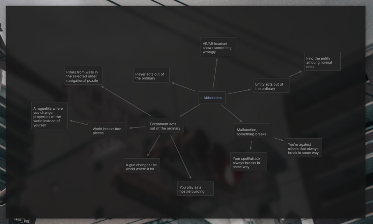
This game was made for a game jam, and the theme was aberration. Most of my ideas were about making either a broken robot thing or a building that acts with a mind of its own. The latter is what I landed on in the end, with moving walls that the building tries to stop you with.
Prototyping
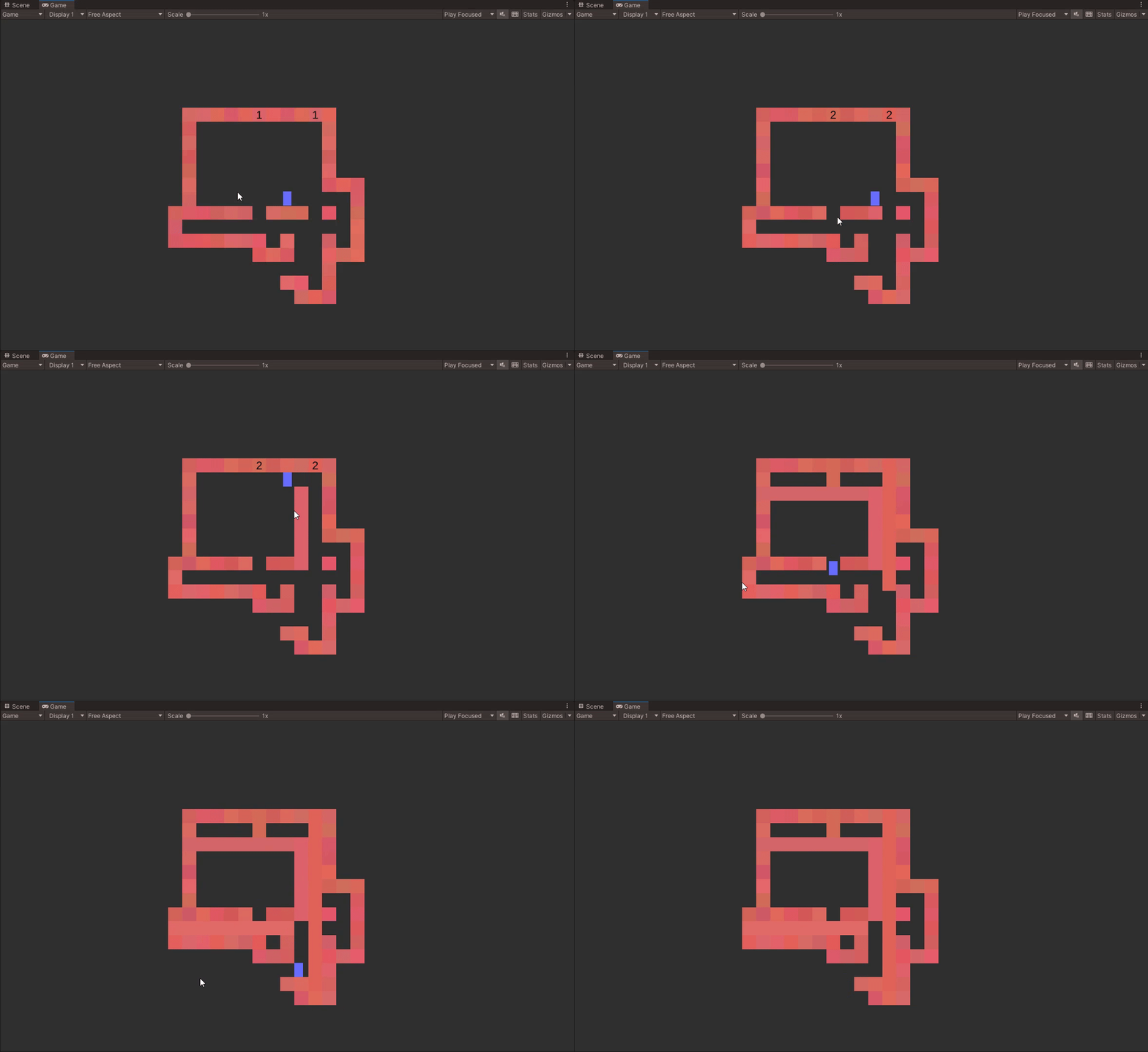
In the initial concept the player didn't have any direct control over the environment, and all the walls extended one tile at a time on their own; the player only had to navigate the level in the correct order.

It took one evening to implement and turned out to be pretty lame and didn't provide nearly enough depth to make a decent puzzle game.
Next idea: every wall extends on click until it hits the opposite wall. If player is in the way, a wall would squish them too. Couldn't resist and added screenshake to this prototype since it just begged to be there.

This was pretty enjoyable as a mindless toy, which is always a good sign. I played around with some layouts for a bit and realized that it doesn't work, again; so I added more complexity on top—timers that extend walls automatically after a number of moves, and safe zones that the player can go through but pillars can't.

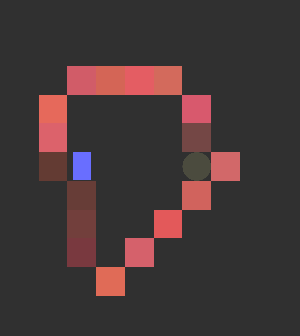
I made a grand total of one obvious puzzle and decided that I didn't love the safe zones; they felt inelegant, like an extra component on top of a good system. I tried to make all pillars safe for the player instead: they would stop before reaching the opposite wall. Suddenly the player position in the world played a big role. I made a puzzle with this configuration:
You may notice that it's stupidly big and needlessly complex. It didn't start out that bad, but I had to add more and more elements to make it harder to cheese. Not a good sign! Was obvious at this point that I had to limit the extension ability to only some of the walls, can't be all of them. Another attempt, can be recognizable if you've played the game (no gif for this one):
This one was nicer just because it was smaller... but there's no challenge or fun insight here, just a pretty straightforward non-puzzle. No good, I needed a new mechanic. Here's what I came up with and my thoughts at the time:
BOX-PUSHING: lame, don't want to do it.
BUTTONS: also lame, feels alien to the design. keep it navigational.
LIMITED USES: doesn't really solve anything.
REPEAT THE IMAGE: fun but completely different, don't feel like it.
FIXED LENGTH: very nonogram-like. sounds like it could work, should try.
BREAK WITH PILLARS: as like a separate pillar type. breaks the entire pillar. should try.
I tinkered with an idea where every wall had a length written on it which it will extend to, but quickly scrapped it; it made everything too complex. So, breaking pillars with other pillars it is.
Here's the first puzzle that I made with the new mechanic:
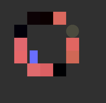
Immediately I liked it a lot, since it barely has any elements in it (there's three extra red walls on the screenshot!) but it isn't obvious to solve. I sent this puzzle to a friend and it took them a couple minutes. Yesss!! I played with some layouts for a bit and made another level, also with an extra element.
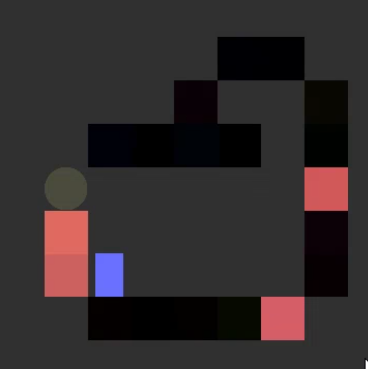
At this point I was happy with the mechanic and started planning the game's structure.
Progression
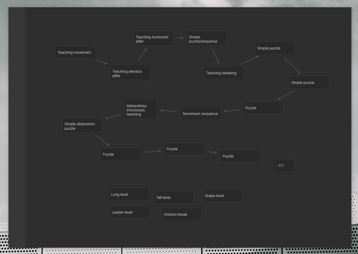
Something I was very interested in exploring with the game was making it feel like an adventure and not just like a set of levels. My initial plan was to make all levels on a single scene, where you would move from level to level by standing on a very long vertical pillar that shoots you to the next puzzle; it was a terrible idea which would make reloading and saving much more complex and, more importantly, would make levels a nightmare to restructure or add something to.
Instead I decided to make every level "rebuild itself" in the dark; every level would start with the player in the same position where they finished the last one. I'm proud of this little thing, but in hindsight, it wasn't worth it: I wasn't able to rework the levels too much after I put them all in place, since they were all dependent on the previous and next levels' positions of the lever and the player.
Another thing I really wanted to try and make were a few non-puzzle adventure levels where you just use the mechanic without much challenge and take a break from all the thinking. I also wanted to fool the player into thinking that the game will end before any new mechanics appear, and then introduce a new batch of levels and the timer thing. I ended up making a progression counter for the initial 9 levels, and then threw the player into a short walking interlude before introducing them to the new mechanic. Pretty happy with how it turned out.
Puzzle Design
I generally don't like complex and overwhelming puzzles; what I'm always trying to do when making one is to make it as small as possible while keeping its core idea. Initially the puzzles had extra active walls to mislead the player but I realized that those only show that the puzzle isn't interesting enough on its own, so I ended up never using those in the final game.
I went for a more relaxed experience and tried to introduce not only the mechanics, but the thought patterns in separate levels: the one where the number on the timer is odd while the distance to it is even teaches you the pattern you need for the last level. I kind of failed at it with the last level before the fall—many players took a long time to realize that you can break pillars with opposite pillars, and I could have properly introduced that earlier without spoiling the fun of the puzzle.
My approach with making the levels was pretty mindless; I just threw stuff in the editor and moved it around until something clicked. Some levels came from shape ideas I wanted to try—like the tall level, the staircase level, and a few scrapped ones. Only a few came from an interaction idea that I came up with separately.
Learnings
- Putting short mindless interludes between puzzles is fun. Using mechanics for little interactive cutscenes is cool, too.
- It's important to make level creation as streamlined as possible, because iteration is king.
- Playtesting is king, too. Should always reserve more time for it with future games.
- Passable 8×8 pixel art is fairly easy to make.
- I like tile-based, jump-less puzzle platforming.
- Trying to make levels based on a vague shape (tall, long, stairs) is useful.
- I think the game being very minimal, short and fairly easy doesn't really allow people to neither hate it nor love it too much.
The game was received better than all my previous small games combined and was shared by some cool people, which I'm happy about. I have a few ideas about expanding Maintenance to a commercial release but I probably won't do it, I'd like to move on and make something new and better.
Thank you for playing and reading! :)
Get Maintenance
Maintenance
The structure needs calibration.
| Status | Released |
| Author | leth |
| Genre | Puzzle, Adventure |
| Tags | 2D, Atmospheric, Destruction, Pixel Art, Short, Singleplayer, Turn-based |
Comments
Log in with itch.io to leave a comment.
When I was playing Maintenence I kept thinking that all the mechanics clicked together in a way that just felt right, but I never stopped to think about the trial and error it must have taken to land on that simple but perfect set of mechanics. This was a great read for learning your thought process and also inspirational to me in how I can approach game design problems and develop tighter games!
I think you made a lot of really clever decisions that paid off. You mention that you wanted to avoid overwhelming puzzles and that's something I actually thought about when I was playing your game -- a lot of puzzle games (especially the shorter ones you find in jams) ramp up complexity to a degree that I look at a level and I don't even know where to begin, but your restraint in designing even your hardest levels encouraged me to keep trying different movements and patterns until I got to the end. In a way, playing the game itself is like an act of constant iteration, so that's a fun bit of meta.
Awesome game, and awesome dev log!
Super interesting read! Really cool to see the thought process behind the design to this game and how much thought went into it, and all that iteration was worth it, the game turned out great!